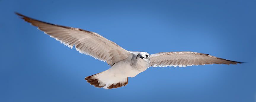
I think this is the best of the three you posted.
I like the simple composition. The spreading wings forms a nice diagonal from the lower left to the upper right. Exposure was just right that the whiteness of the feather was not blown out. The lighting is also excellent. I like the backlighting of the sun while the reflection from the sand (or the foreground) did a great job in filling.
At this size, I can't tell if the image is razor sharp or not, or if there was enough resolution to do a 16x20 enlargement. If you do, it is definitely worth hanging in your study's wall.
Good job.
Here's one I took from Florida as well early this year.

. |